(And Why Your Project Timeline Visual Is Trying to Tell You Something)
Most project managers have a Gantt chart. Far fewer actually read one.
There’s a difference. Having a visual project timeline means the chart exists. Reading it means you’re extracting the intelligence buried inside it – the dependencies about to create a bottleneck, the tasks that are quietly slipping, the single delay that’s going to ripple into three missed milestones.
That’s what this guide is about. By the end, you’ll know exactly how to read a Gantt chart, how to visualize project progress in a way that drives decisions rather than just documents status, and how modern AI-native tools are making timeline intelligence accessible to every project manager – not just the ones with a PMP certification.
What Is a Project Timeline Visual, Really?
A project timeline visual is a snapshot of your project’s logic, not just its schedule.
Most people look at a Gantt chart and see a list of tasks with colored bars. What they’re actually looking at is a map of:
- Sequence – what has to happen before what
- Duration – how long each piece of work actually takes
- Dependencies – which tasks are chained together, meaning a delay in one is a delay in all
- Capacity – who is doing what, and whether the workload is realistic
- Risk – where the plan is fragile and where it has room to breathe
When you learn to read all five layers, your timeline stops being a reporting tool and becomes a thinking tool. That’s the shift this guide is designed to create.
A Quick History (So You Understand Why Gantt Charts Look the Way They Do)
Henry Gantt developed his chart in the 1910s to manage industrial production – shipbuilding and manufacturing, specifically. The logic was simple: represent time on the horizontal axis, tasks on the vertical axis, and use bars to show duration.
Over a century later, the fundamental structure hasn’t changed. What has changed is the intelligence layered on top of it. Modern project tracking software adds dependency lines, critical path highlighting, resource views, baseline comparisons, and real-time data feeds – turning a static scheduling tool into a dynamic project intelligence system.
Understanding the original structure makes the modern version much easier to read.
How to Read a Gantt Chart: The 6 Core Elements
Element 1: The Task List
The vertical list on the left side of a Gantt chart is your work breakdown structure – every piece of work your project requires, organized hierarchically.
How to read it:
- Indented items are subtasks of the parent task above them
- Bold or highlighted rows typically indicate milestone events (more on these shortly)
- The order represents sequence, not just alphabetical listing – tasks higher up often must complete before tasks below them begin
What to look for: Gaps in the task list are often where projects fail. If you look at your task column and notice an entire phase of work seems to have only 2-3 items, that’s worth questioning. Either the work is genuinely simple, or tasks are missing.
PMI — “Work Breakdown Structure: Basic Principles”
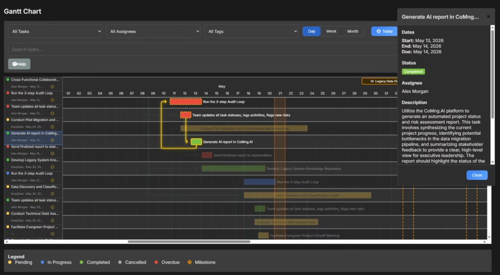
Element 2: The Timeline Header (Top Row)
The horizontal axis shows time – typically broken into days, weeks, or months depending on your project duration.
How to read it:
- Short projects (under 4 weeks): Day-level granularity
- Medium projects (1-6 months): Week-level granularity
- Long projects (6+ months): Month-level granularity
What to look for: Check whether the timeline starts before today. If significant tasks are scheduled in the past and their bars haven’t been marked complete, you’re already looking at slippage. This is often the fastest way to identify a project that’s in trouble before anyone has admitted it.
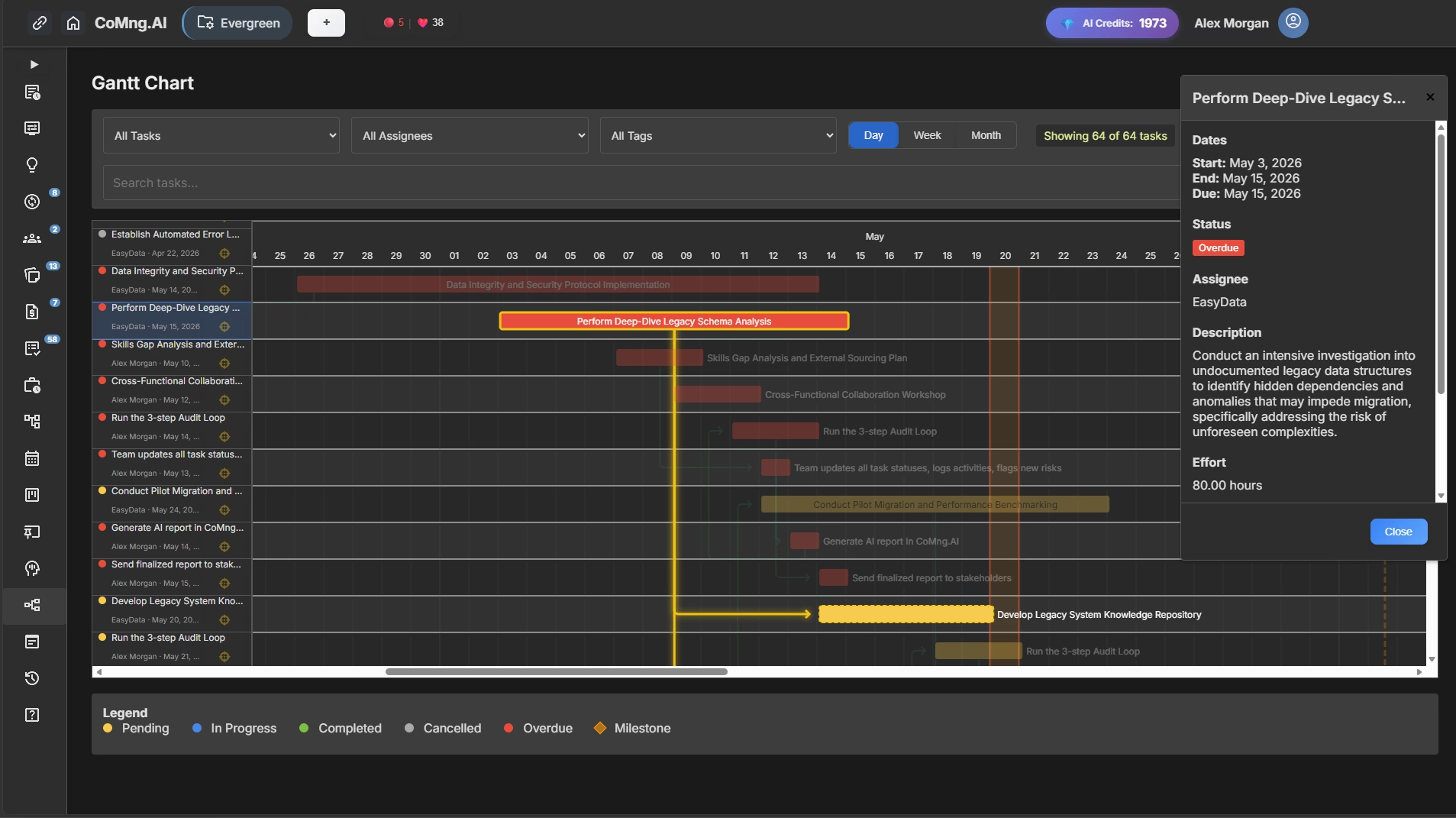
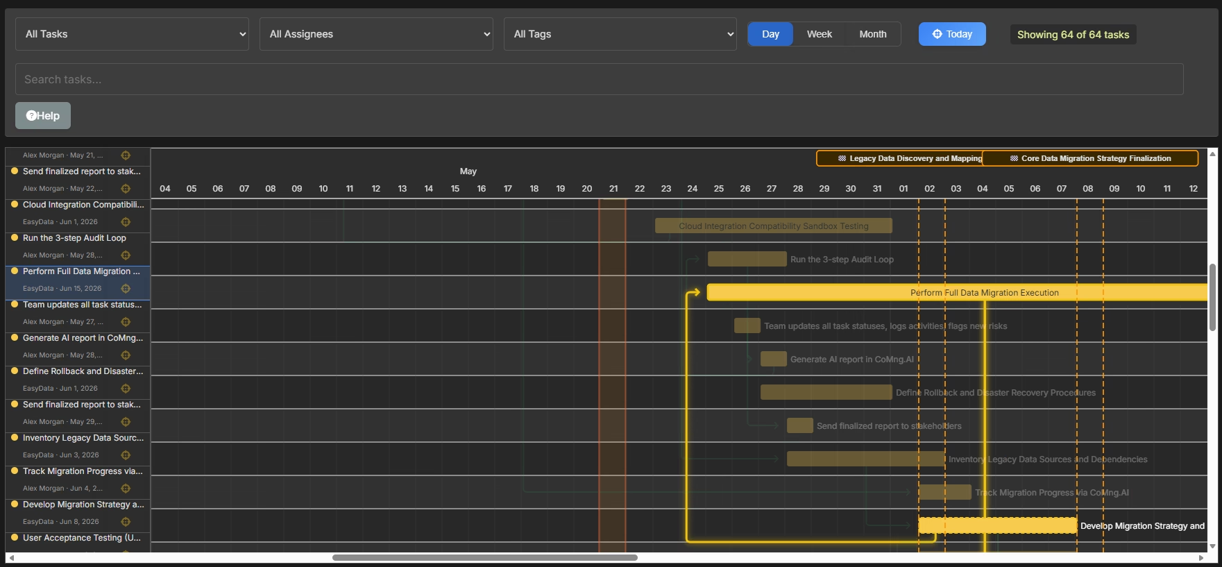
Element 3: The Task Bars
The horizontal bars are what most people focus on – and they contain more information than they appear to.
How to read them:
- Bar length = task duration
- Bar position = when the task is scheduled (left edge = start, right edge = end)
- Bar color = usually indicates status (pending, in progress, completed, overdue) or ownership
What to look for:
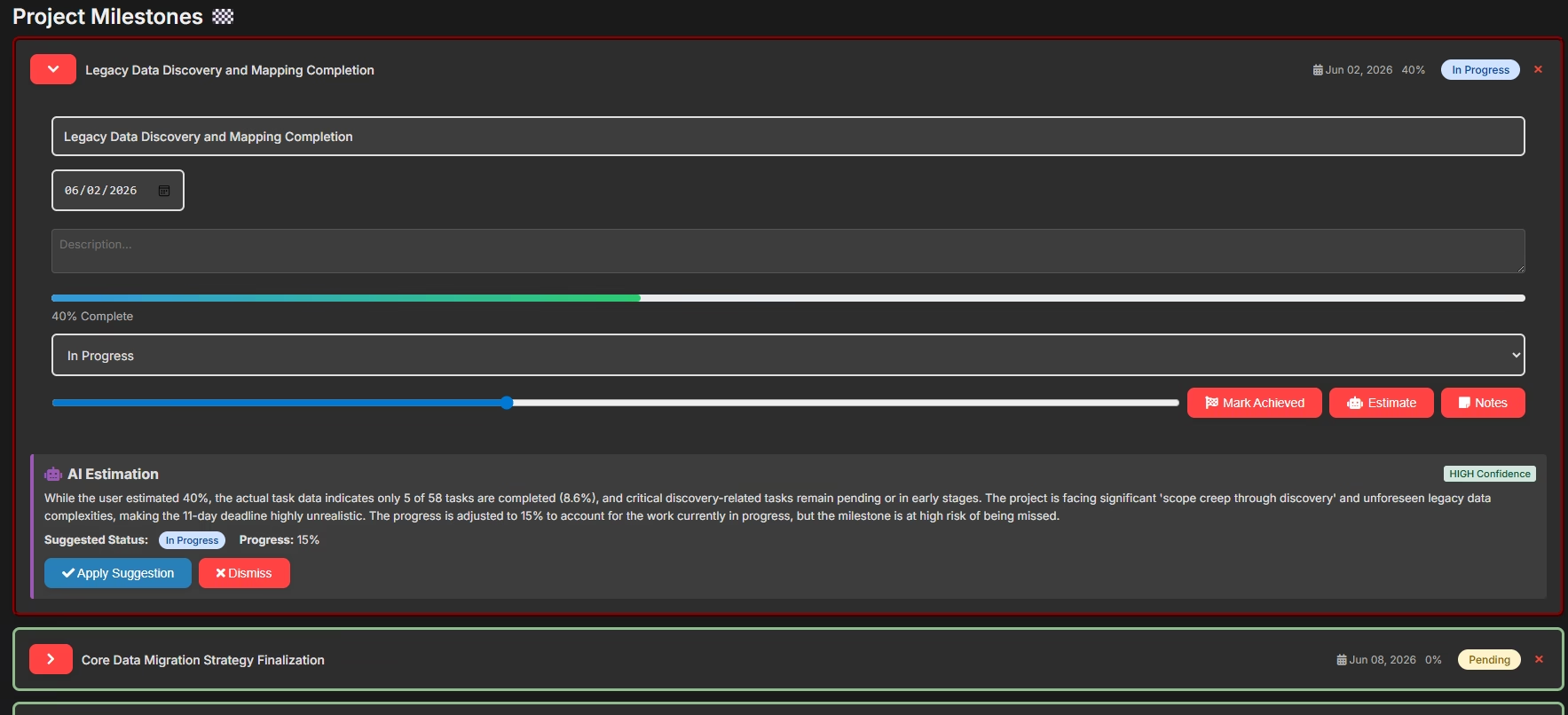
Completed vs. planned completion: Many platforms show a “progress fill” within each bar – a darker shading that shows how far along the task is proportionally. If a bar is 80% through its scheduled duration but the fill shows only 30% complete, that task is in trouble.
Very long bars: Tasks with multi-week durations are often under-decomposed. A four-week task with no subtasks is essentially a black box – you have no visibility into whether it’s on track until it either finishes or doesn’t. Long bars are candidates for breakdown.
Bunched bars: If most of your project’s work is concentrated in a short period of your timeline, your project has a capacity problem. AI-powered project planning tools often flag this automatically.
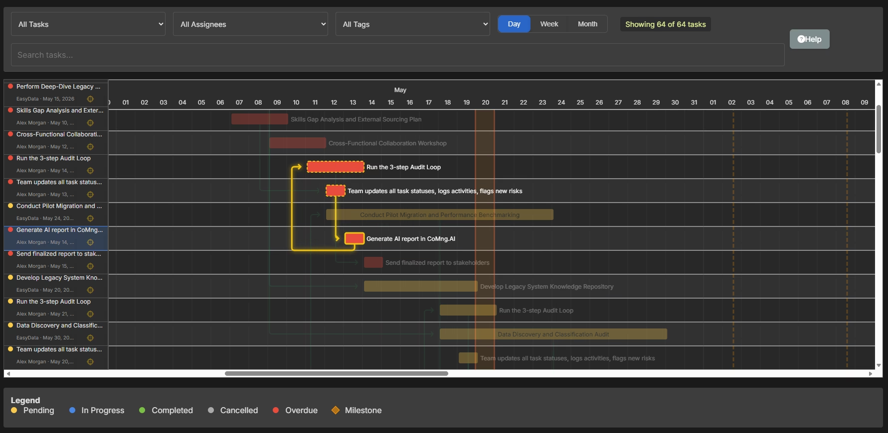
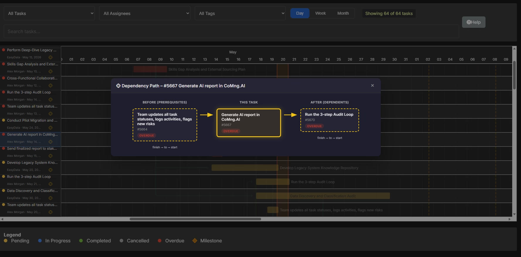
Element 4: Dependency Lines (The Most Important Element Most People Ignore)
Dependency lines are the arrows connecting task bars to each other. They show which tasks must finish before another can begin.
This is the most valuable – and most commonly ignored – element of any project timeline visual.
How to read them:
The most common dependency type is Finish-to-Start: Task B cannot begin until Task A is complete. The arrow points from the end of Task A to the start of Task B.
What to look for:
Long chains of sequential dependencies: If you trace a line of arrows from an early task all the way to a late-project task, you’ve found a dependency chain. Any delay anywhere in that chain ripples forward to the end. This chain is often the critical path (more on this below).
Arrows that cross: When dependency lines cross each other on the chart, it usually signals scheduling complexity. These “crossing points” often represent resource conflicts – the same person or resource needed in two places at once.
Tasks with no dependencies: Every task that floats freely without connecting to anything else should raise a question: is this truly independent, or is it missing connections that would reveal scheduling constraints?
Element 5: Milestones
Milestones are zero-duration events – they represent a moment in time rather than a period of work. On a Gantt chart, they typically appear as diamond shapes or vertical lines.
How to read them: Milestones mark moments that matter: a deliverable due to a client, a phase gate requiring approval, a contractual deadline, a go/no-go decision point.
What to look for:
Work backward from each milestone to the tasks feeding into it. Is there enough time? Are there dependency chains leading to the milestone that leave no buffer? A milestone with zero slack – meaning any task delay causes the milestone to slip – is a risk event waiting to happen.
Element 6: The Critical Path
The critical path is the longest chain of dependent tasks from your project’s start to its end. It’s the sequence of work that determines your minimum possible project duration.
Any delay on the critical path = a delay to the entire project. No exceptions.
How to read it: Most modern project management software highlights the critical path in a distinct color – often red. In CoMng.AI, the critical path is automatically calculated and highlighted based on your task dependencies and durations.
What to look for:
Tasks on the critical path with high risk ratings: These are your highest-priority items for mitigation. A delay here doesn’t affect one task – it affects the project’s completion date.
How much of your project is critical path: If 90% of your tasks are on the critical path, your schedule has no resilience. A single unexpected delay anywhere creates a cascade. Healthy project timelines have non-critical tasks with buffer (called “float” or “slack”) that can absorb minor delays without affecting the end date.
Changes to the critical path over time: As tasks complete and others begin, the critical path shifts. A path that wasn’t critical at the start of your project can become critical if a non-critical task runs significantly late.
PMI – “Practice Standard for Scheduling, Third Edition”
How to Visualize Project Progress: 4 Methods That Actually Work
Reading a Gantt chart is one skill. Communicating project progress to others – stakeholders, clients, leadership – requires a slightly different set of tools. Here’s how to visualize project progress for different audiences and purposes.
Method 1: The Baseline Comparison View
A baseline is a snapshot of your original project plan – the schedule as it was when the project started. A baseline comparison overlays your current schedule on top of your original, making slippage instantly visible.
What it shows:
- Tasks that have shifted right (later than planned)
- Tasks that are ahead of schedule
- The cumulative effect of changes on your end date
Best for: Project health conversations with sponsors and leadership. It answers the most important question – “Are we where we said we’d be?” – without requiring any explanation.
How to use it in CoMng.AI: CoMng.AI’s Project Snapshots feature lets you save the project state at any point in time and compare it against current status – giving you a baseline view at any stage of the project.
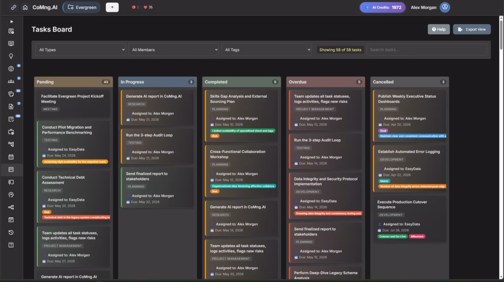
Method 2: The Kanban Board (For Operational Status)
For day-to-day team visibility, a Kanban board often communicates project progress more intuitively than a Gantt chart. Instead of time on the horizontal axis, you have status columns: Pending → In Progress → Completed (with Overdue as a critical flag).
What it shows:
- Where work is right now
- How many tasks are stuck or overdue
- Team velocity (how quickly work moves through the board)
- Bottlenecks (columns that accumulate tasks without clearing)
Best for: Weekly team standups, sprint reviews, and operational check-ins where the question is “what’s moving and what’s stuck?” rather than “are we on schedule?”
How to use both together: Use your Kanban board for team-level operational clarity. Use your Gantt chart for stakeholder-level timeline communication. They answer different questions – and you need both.
Method 3: The Milestone Tracker (For Executive Audiences)
Executives and clients don’t need to see every task. They need to see whether the project is hitting its key checkpoints.
A milestone tracker distills your entire visual project timeline into a simple, scannable view: a list of milestones, their planned dates, their current forecast dates, and a status indicator (green/yellow/red).
What it shows:
- Are we going to hit the dates that matter?
- If not, how far off are we?
- What’s the reason for any milestone at risk?
Best for: Monthly stakeholder reports, client updates, board presentations. It’s the “one page summary” of your Gantt chart that busy decision-makers will actually read.
Method 4: The AI-Generated Status Report (For Comprehensive Updates)
For formal reporting cycles, CoMng.AI automatically generates comprehensive project status reports that synthesize your timeline data with budget status, risk flags, team performance, and milestone achievement – formatted for your specific audience.
This doesn’t replace your judgment (see our AI Audit Loop guide for how to verify AI reports before they go out). It gives you a professional, data-complete draft in minutes that you then review, contextualize, and send.
The Most Common Mistakes When Reading a Visual Project Timeline
Even experienced project managers misread timelines. Here are the patterns to watch for:
Mistake 1: Looking at individual tasks instead of chains A single task being 3 days late is meaningless on its own. The question is: what does that 3-day delay do to everything connected downstream? Always trace dependency lines before assessing impact.
Mistake 2: Ignoring the tasks with no progress indicators The tasks that have no activity logged against them – no time tracked, no status updates, no comments – are often the ones hiding the real problems. Silence isn’t safety.
Mistake 3: Treating the end date as fixed when the inputs have changed If scope has expanded, resources have changed, or risks have materialized, your end date needs to be recalculated – not defended. A timeline visual that doesn’t reflect reality is worse than no timeline at all, because it creates false confidence. CoMng.AI can auto recalculate timelines and re-plan your project.

Mistake 4: Only reviewing the timeline at formal reporting intervals Your project timeline is a living document. The moment between weekly reviews is when problems develop. Set up regular (even brief) personal reviews of your Gantt chart – not to report, but to think.
Mistake 5: Showing stakeholders raw Gantt charts without context A detailed Gantt chart handed to a non-PM stakeholder without explanation often creates more confusion than clarity. Match the visualization format to the audience, and always provide narrative context alongside any visual.
How CoMng.AI Makes Your Project Timeline Visual Smarter
Traditional project management software requires you to build your timeline manually: create tasks, set dates, draw dependencies, estimate durations, assign resources. This takes days – and the quality of the result depends entirely on your experience and the thoroughness of your planning.
CoMng.AI’s approach is different.
When you describe your project – the goals, constraints, team, and timeline – the AI automatically generates a complete project framework including:
- Full task breakdown with dependencies already mapped
- Realistic duration estimates based on industry benchmarks
- Automatic timeline optimization – tasks are sequenced and scheduled based on dependencies and resource availability
- Instant Gantt chart – ready to review and refine, not build from scratch
- Critical path identification – highlighted automatically from day one
- Risk flags on the timeline – high-risk tasks surfaced before they become problems
The result is a visual project timeline that’s comprehensive and intelligent on day one – not after weeks of manual planning.
What you then add: Your organizational context, your team’s specific constraints, your knowledge of stakeholder sensitivities and political dynamics. The AI gives you the structure; you give it the soul.
Your Project Timeline Is Trying to Tell You Something
Every project Gantt chart contains early signals of what’s about to go wrong – and early confirmation of what’s going well. The difference between project managers who seem to always know what’s happening and those who are perpetually surprised isn’t luck. It’s the ability to read those signals.
The framework in this guide gives you that ability:
- Read the six core elements – tasks, timeline, bars, dependencies, milestones, and critical path
- Use the right visualization method for the right audience
- Avoid the five most common misreading mistakes
- Let AI generate and maintain the structural intelligence so you can focus on the interpretive judgment only a human provides
Ready to see what a truly intelligent visual project timeline looks like?
CoMng.AI’s includes full access to the Gantt chart, Kanban board, critical path analyzer, and AI-powered timeline generation. Create a real project and have a complete visual timeline – with dependencies, milestones, and critical path – in under an hour.